

Meadery of the Rockies
Rebranding and New PackagingLabel Concepts
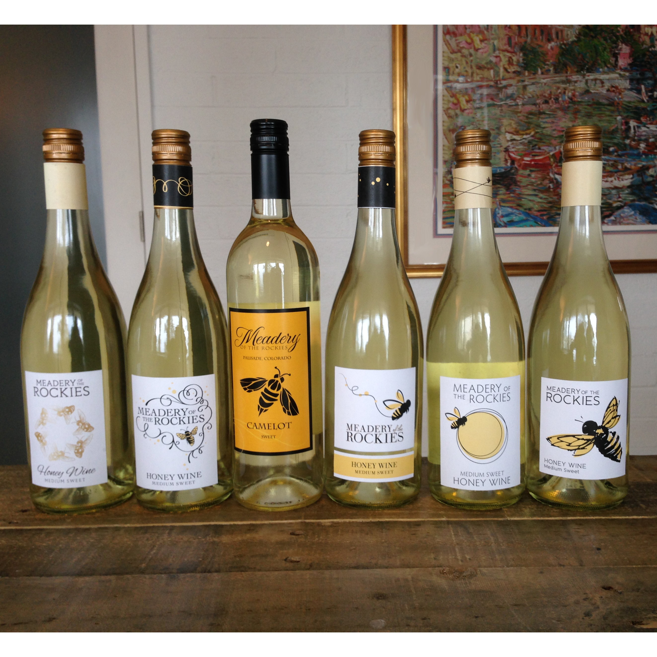
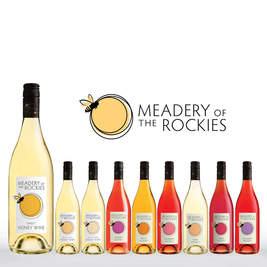
New Logo
New Packaging for the Brand
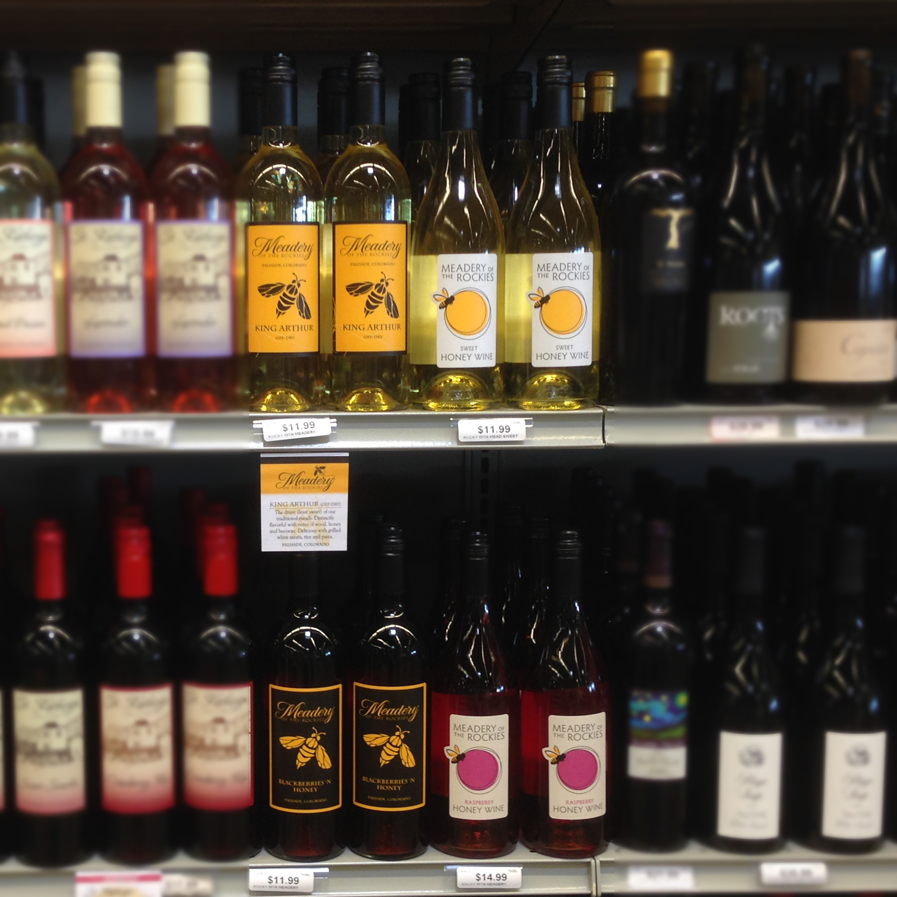
Improved Shelf Impact
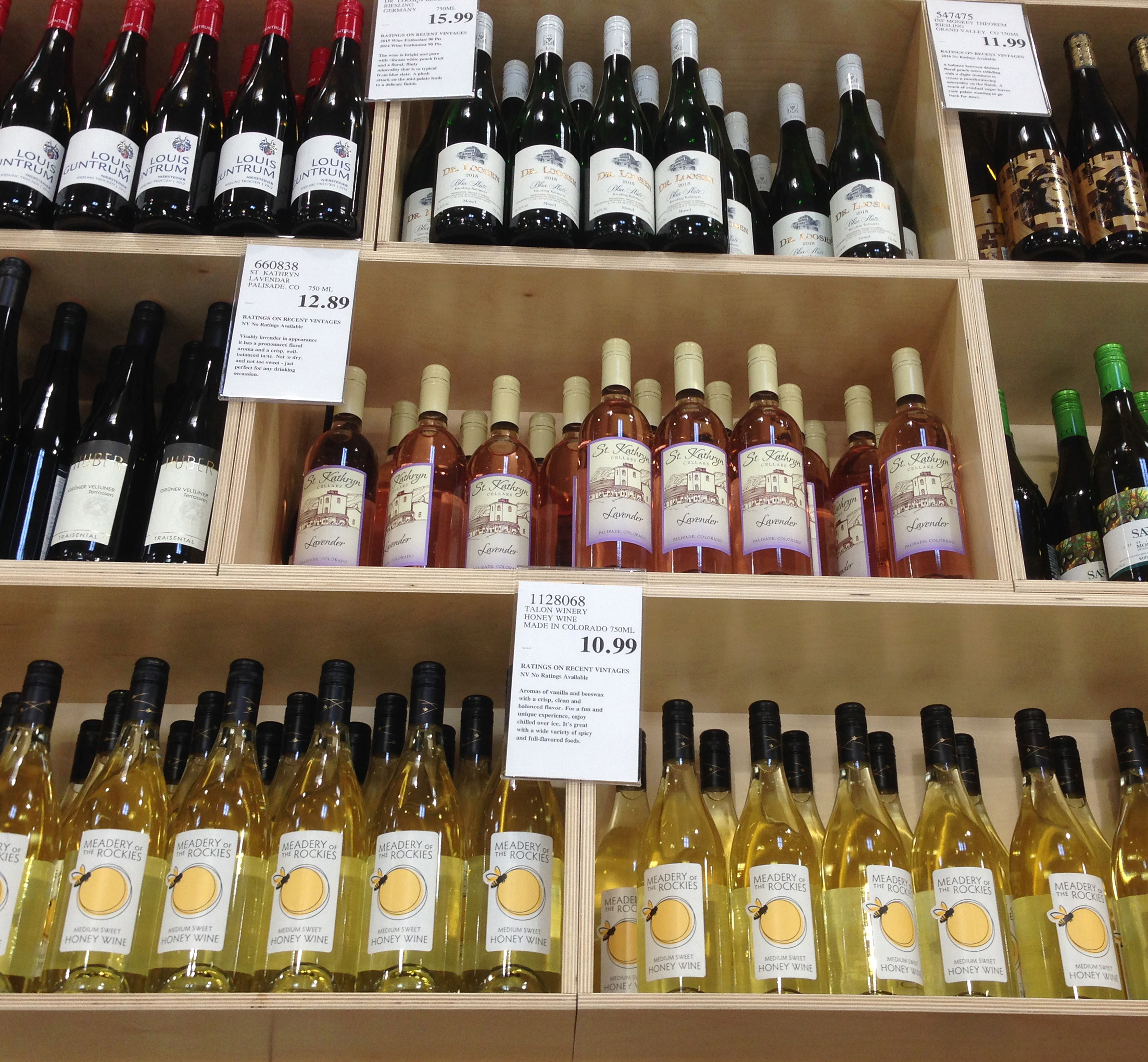
Costco Demo
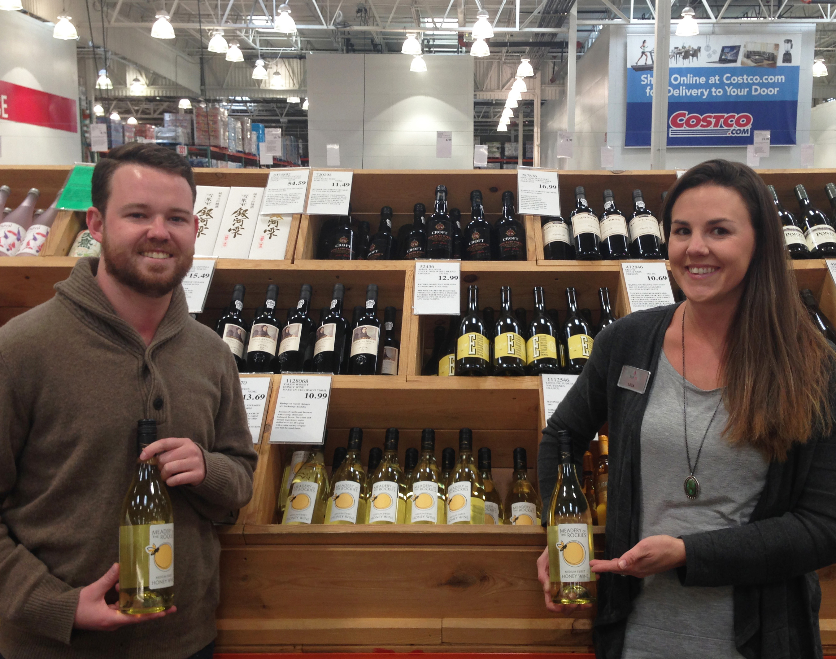
New Distribution
About This Project
For Meadery of the Rockies to grow and reach out to mainstream consumers it was obvious to us that the brand needed a friendlier, more relevant image. It needed a complete rebranding, and with packaging that would stand out on the shelf. Strategically, we decided to focus on honey for a number of reasons. Besides being easier to understand, honey has many positive attributes. So number one, we changed the brand’s statement of identity to simply, “Honey Wine”. Then the brand’s identity/logo. From our positioning work, we wanted to communicate, metaphorically, the brand’s benefit of “energy”. Next, the icon itself. The current bee was too bold, lifeless, and unfriendly…definitely not very inviting if we wanted to bring new consumers to the brand. Instead, we decided to add a bit of abstract whimsy with a friendlier bee and a vibrant color circle (sun, top view of a wine glass, etc.) surrounded by “energetic” bee flight lines. Read the full story in our Blog, “A Honey of a Rebranding“.